Data Visualization
Contents
Data Visualization
In good information visualization, there are no rules, no guidelines, no template, no standard technologies, no stylebook… You must simply do whatever it takes
― Edward Tufte
Data visualization is an essential tool for data science at every step of analysis, from data cleaning to EDA to communicating conclusions and predictions. Because human minds are highly developed for visual perception, a well-chosen plot can often reveal trends and anomalies in the data much more efficiently than a textual description.
To effectively use data visualizations, you must be proficient with both the programming tools to generate plots and the principles of visualization. In this tutorial we will introduce seaborn and matplotlib, our tools of choice for creating plots. We will also learn how to spot misleading visualizations and how to improve visualizations.
Visualizing Quantitative Data
We generally use different types of charts to visualize quantitative (numerical) data and qualitative (ordinal or nominal) data.
For quantitative data, we most often use histograms, box plots, and scatter plots.
We can use the seaborn plotting library to create these plots in Python. We will use a dataset containing information about passengers aboard the Titanic.
# Import seaborn and apply its plotting styles
import numpy as np
import pandas as pd
import seaborn as sns
import warnings
warnings.filterwarnings("ignore")
sns.set()
# Load the dataset and drop N/A values to make plot function calls simpler
titanic = sns.load_dataset('titanic').dropna().reset_index(drop=True)

print(titanic.shape)
titanic.head()
(182, 15)
| survived | pclass | sex | age | sibsp | parch | fare | embarked | class | who | adult_male | deck | embark_town | alive | alone | |
|---|---|---|---|---|---|---|---|---|---|---|---|---|---|---|---|
| 0 | 1 | 1 | female | 38.0 | 1 | 0 | 71.2833 | C | First | woman | False | C | Cherbourg | yes | False |
| 1 | 1 | 1 | female | 35.0 | 1 | 0 | 53.1000 | S | First | woman | False | C | Southampton | yes | False |
| 2 | 0 | 1 | male | 54.0 | 0 | 0 | 51.8625 | S | First | man | True | E | Southampton | no | True |
| 3 | 1 | 3 | female | 4.0 | 1 | 1 | 16.7000 | S | Third | child | False | G | Southampton | yes | False |
| 4 | 1 | 1 | female | 58.0 | 0 | 0 | 26.5500 | S | First | woman | False | C | Southampton | yes | True |
Histograms
We can see that the dataset contains one row for every passenger. Each row includes the age of the passenger and the amount the passenger paid for a ticket. Let’s visualize the ages using a histogram. We can use seaborn’s distplot function:
# Adding a semi-colon at the end tells Jupyter not to output the
# usual <matplotlib.axes._subplots.AxesSubplot> line
sns.distplot(titanic['age']);
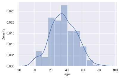
By default, seaborn’s distplot function will output a smoothed curve that roughly fits the distribution. We can also add a rugplot which marks each individual point on the x-axis:
sns.distplot(titanic['age'], rug=True);
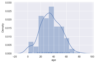
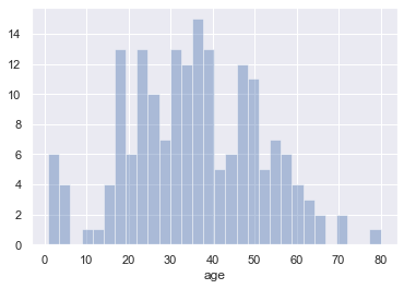
We can also plot the distribution itself. Adjusting the number of bins shows that there were a number of children on board.
sns.distplot(titanic['age'], kde=False, bins=30);
Box plots
Box plots are a convenient way to see where most of the data lie. Typically, we use the 25th and 75th percentiles of the data as the start and endpoints of the box and draw a line within the box for the 50th percentile (the median). We draw two “whiskers” that extend to show the the remaining data except outliers, which are marked as individual points outside the whiskers.
sns.boxplot(x='fare', data=titanic);
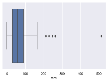
We typically use the Inter-Quartile Range (IQR) to determine which points are considered outliers for the box plot. The IQR is the difference between the 75th percentile of the data and the 25th percentile.
lower, upper = np.percentile(titanic['fare'], [25, 75])
iqr = upper - lower
iqr
60.3
Values greater than 1.5 \(\times\) IQR above the 75th percentile and less than 1.5 \(\times\) IQR below the 25th percentile are considered outliers and we can see them marked indivdiually on the boxplot above:
upper_cutoff = upper + 1.5 * iqr
lower_cutoff = lower - 1.5 * iqr
upper_cutoff, lower_cutoff
(180.45, -60.749999999999986)
Although histograms show the entire distribution at once, box plots are often easier to understand when we split the data by different categories. For example, we can make one box plot for each passenger type:
sns.boxplot(x='fare', y='who', data=titanic);
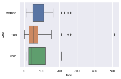
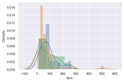
The separate box plots are much easier to understand than the overlaid histogram below which plots the same data:
sns.distplot(titanic.loc[titanic['who'] == 'woman', 'fare'])
sns.distplot(titanic.loc[titanic['who'] == 'man', 'fare'])
sns.distplot(titanic.loc[titanic['who'] == 'child', 'fare']);
Seaborn features
You may have noticed that the boxplot call to make separate box plots for the who column was simpler than the equivalent code to make an overlaid histogram. Although sns.distplot takes in an array or Series of data, most other seaborn functions allow you to pass in a DataFrame and specify which column to plot on the x and y axes. For example:
# Plots the `fare` column of the `titanic` DF on the x-axis
sns.boxplot(x='fare', data=titanic);
When the column is categorical (the 'who' column contained 'woman', 'man', and 'child'), seaborn will automatically split the data by category before plotting. This means we don’t have to filter out each category ourselves like we did for sns.distplot.
# fare (numerical) on the x-axis,
# who (nominal) on the y-axis
sns.boxplot(x='fare', y='who', data=titanic);

Scatter Plots
Scatter plots are used to compare two quantitative variables. We can compare the `age` and `fare` columns of our Titanic dataset using a scatter plot.
sns.lmplot(x='age', y='fare', data=titanic);
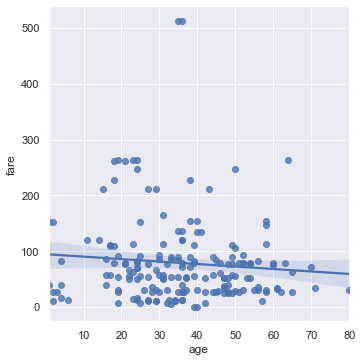
By default seaborn will also fit a regression line to our scatterplot and bootstrap the scatterplot to create a 95% confidence interval around the regression line shown as the light blue shading around the line above. In this case, the regression line doesn’t seem to fit the scatter plot very well so we can turn off the regression.
sns.lmplot(x='age', y='fare', data=ti, fit_reg=False);
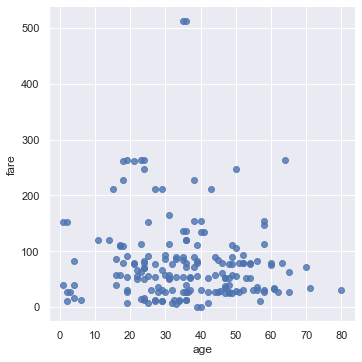
We can color the points using a categorical variable. Let’s use the who column once more:
sns.lmplot(x='age', y='fare', hue='who', data=ti, fit_reg=False);
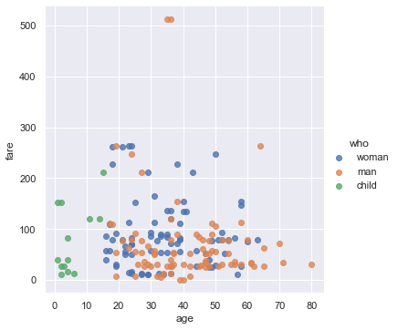
From this plot we can see that all passengers below the age of 18 or so were marked as child. There doesn’t seem to be a noticable split between male and female passenger fares, although the two most expensive tickets were purchased by males.
Visualizing Qualitative Data
For qualitative or categorical data, we most often use bar charts and dot charts. We will show how to create these plots using seaborn and the Titanic survivors dataset.
import numpy as np
import pandas as pd
import seaborn as sns
import warnings
warnings.filterwarnings("ignore")
sns.set()

# Load the dataset
titanic = sns.load_dataset('titanic').reset_index(drop=True)

# This table is too large to fit onto a page so we'll output sliders to
# pan through different sections.
titanic.head()
| survived | pclass | sex | age | sibsp | parch | fare | embarked | class | who | adult_male | deck | embark_town | alive | alone | |
|---|---|---|---|---|---|---|---|---|---|---|---|---|---|---|---|
| 0 | 0 | 3 | male | 22.0 | 1 | 0 | 7.2500 | S | Third | man | True | NaN | Southampton | no | False |
| 1 | 1 | 1 | female | 38.0 | 1 | 0 | 71.2833 | C | First | woman | False | C | Cherbourg | yes | False |
| 2 | 1 | 3 | female | 26.0 | 0 | 0 | 7.9250 | S | Third | woman | False | NaN | Southampton | yes | True |
| 3 | 1 | 1 | female | 35.0 | 1 | 0 | 53.1000 | S | First | woman | False | C | Southampton | yes | False |
| 4 | 0 | 3 | male | 35.0 | 0 | 0 | 8.0500 | S | Third | man | True | NaN | Southampton | no | True |
Bar Charts
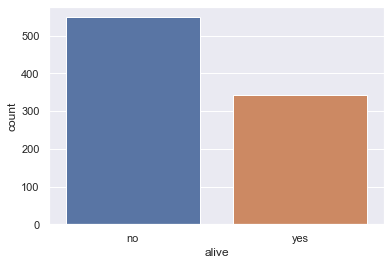
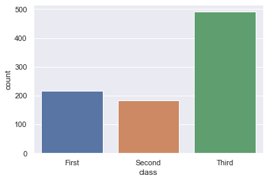
In seaborn, there are two types of bar charts. The first type uses the countplot method to count up the number of times each category appears in a column.
# Counts how many passengers survived and didn't survive and
# draws bars with corresponding heights
sns.countplot(x='alive', data=titanic);
sns.countplot(x='class', data=titanic);
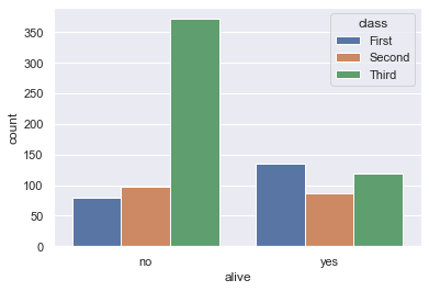
# As with box plots, we can break down each category further using color
sns.countplot(x='alive', hue='class', data=titanic);
The barplot method, on the other hand, groups the DataFrame by a categorical column and plots the height of the bars according to the average of a numerical column within each group.
# For each set of alive/not alive passengers, compute and plot the average age.
sns.barplot(x='alive', y='age', data=titanic);
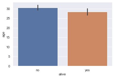
The height of each bar can be computed by grouping the original DataFrame and averaging the age column:
titanic[['alive', 'age']].groupby('alive').mean()
| age | |
|---|---|
| alive | |
| no | 30.626179 |
| yes | 28.343690 |
By default, the barplot method will also compute a bootstrap 95% confidence interval for each averaged value, marked as the black lines in the bar chart above. The confidence intervals show that if the dataset contained a random sample of Titanic passengers, the difference between passenger age for those that survived and those that didn’t is not statistically significant at the 5% significance level.
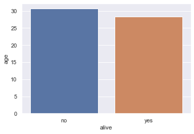
These confidence intervals take long to generate when we have larger datasets so it is sometimes useful to turn them off:
sns.barplot(x='alive', y='age', data=titanic, ci=False);
Dot Charts
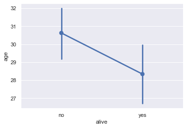
Dot charts are similar to bar charts. Instead of plotting bars, dot charts mark a single point at the end of where a bar would go. We use the pointplot method to make dot charts in seaborn. Like the barplot method, the pointplot method also automatically groups the DataFrame and computes the average of a separate numerical variable, marking 95% confidence intervals as vertical lines centered on each point.
# For each set of alive/not alive passengers, compute and plot the average age.
sns.pointplot(x='alive', y='age', data=titanic);
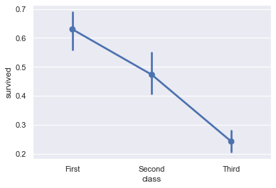
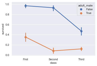
Dot charts are most useful when comparing changes across categories:
# Shows the proportion of survivors for each passenger class
sns.pointplot(x='class', y='survived', data=titanic);
# Shows the proportion of survivors for each passenger class,
# split by whether the passenger was an adult male
sns.pointplot(x='class', y='survived', hue='adult_male', data=titanic);
Customizing Plots using matplotlib
Although seaborn allows us to quickly create many types of plots, it does not give us fine-grained control over the chart. For example, we cannot use seaborn to modify a plot’s title, change x or y-axis labels, or add annotations to a plot. Instead, we must use the matplotlib library that seaborn is based off of.
matplotlib provides basic building blocks for creating plots in Python. Although it gives great control, it is also more verbose — recreating the seaborn plots from the previous sections in matplotlib would take many lines of code. In fact, we can think of seaborn as a set of useful shortcuts to create matplotlib plots. Although we prefer to prototype plots in seaborn, in order to customize plots for communicating our findings we will need to learn basic pieces of matplotlib.
Before we look at our first simple example, we must activate matplotlib support in the notebook:
import numpy as np
import pandas as pd
import seaborn as sns
import warnings
warnings.filterwarnings("ignore")
sns.set()

# This line allows matplotlib plots to appear as images in the notebook
# instead of in a separate window.
%matplotlib inline

# plt is a commonly used shortcut for matplotlib
import matplotlib.pyplot as plt
Customizing Figures and Axes
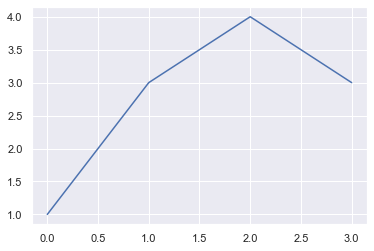
In order to create a plot in matplotlib, we create a figure, then add an axes to the figure. In matplotlib, an axes is a single chart, and figures can contain multiple axes in a tablular layout. An axes contains marks, the lines or patches drawn on the plot.
# Create a figure
figure = plt.figure()

# Add an axes to the figure. The second and third arguments create a table
# with 1 row and 1 column. The first argument places the axes in the first
# cell of the table.
axis = figure.add_subplot(1, 1, 1)

# Create a line plot on the axes
axis.plot([0, 1, 2, 3], [1, 3, 4, 3])

# Show the plot. This will automatically get called in a Jupyter notebook
# so we'll omit it in future cells
plt.show()
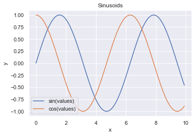
To customize the plot, we can use other methods on the axes object, below we will create some datapoints to plot using the numpy library we learnt in preceding section:
figure = plt.figure()
axis = figure.add_subplot(1, 1, 1)

values = np.arange(0, 10, 0.1)

# Setting the label kwarg lets us generate a legend
axis.plot(values, np.sin(values), label='sin(values)')
axis.plot(values, np.cos(values), label='cos(values)')
axis.legend()

axis.set_title('Sinusoids')
axis.set_xlabel('x')
axis.set_ylabel('y');
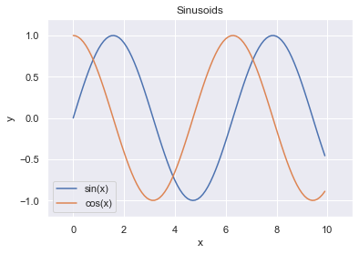
The plt module has analogous methods to an axes, so we can recreate one of the plots above using plt shorthands.
x = np.arange(0, 10, 0.1)

plt.plot(x, np.sin(x), label='sin(x)')
plt.plot(x, np.cos(x), label='cos(x)')
plt.legend()

# Shorthand for ax.set_title
plt.title('Sinusoids')
plt.xlabel('x')
plt.ylabel('y')

# Set the x and y-axis limits
plt.xlim(-1, 11)
plt.ylim(-1.2, 1.2);
Customizing Marks
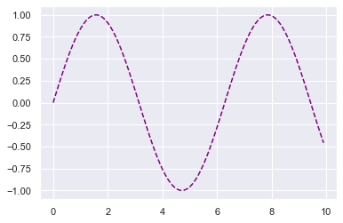
To change properties of the plot marks themselves (e.g. the lines in the plot above), we can pass additional arguments into plt.plot.
plt.plot(x, np.sin(x), linestyle='--', color='purple');
Checking the matplotlib documentation is the easiest way to figure out which arguments are available for each method.
Annotating our charts
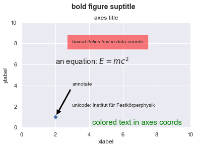
In matplotlib, text can be added either relative to an individual axis object or to the whole figure.
These commands add text to the Axes:
set_title()- add a titleset_xlabel()- add an axis label to the x-axisset_ylabel()- add an axis label to the y-axistext()- add text at an arbitrary locationannotate()- add an annotation, with optional arrow
And these act on the whole figure:
figtext()- add text at an arbitrary locationsuptitle()- add a title
And any text field can contain LaTeX expressions for mathematics, as long as they are enclosed in $ signs.
This example illustrates all of them:
fig = plt.figure()
fig.suptitle('bold figure suptitle', fontsize=14, fontweight='bold')

ax = fig.add_subplot(1, 1, 1)
fig.subplots_adjust(top=0.85)
ax.set_title('axes title')

ax.set_xlabel('xlabel')
ax.set_ylabel('ylabel')

ax.text(3, 8, 'boxed italics text in data coords', style='italic',
        bbox={'facecolor':'red', 'alpha':0.5, 'pad':10})

ax.text(2, 6, 'an equation: $E=mc^2$', fontsize=15)

ax.text(3, 2, 'unicode: Institut für Festkörperphysik')

ax.text(0.95, 0.01, 'colored text in axes coords',
        verticalalignment='bottom', horizontalalignment='right',
        transform=ax.transAxes,
        color='green', fontsize=15)


ax.plot([2], [1], 'o')
ax.annotate('annotate', xy=(2, 1), xytext=(3, 4),
            arrowprops=dict(facecolor='black', shrink=0.05))

ax.axis([0, 10, 0, 10]);
Customizing a seaborn plot using matplotlib
Now that we’ve seen how to use matplotlib to customize a plot, we can use the same methods to customize seaborn plots since seaborn creates plots using matplotlib behind-the-scenes.
# Load seaborn
import seaborn as sns
sns.set()
sns.set_context('talk')

# Load dataset
titanic = sns.load_dataset('titanic').dropna().reset_index(drop=True)
titanic.head()
| survived | pclass | sex | age | sibsp | parch | fare | embarked | class | who | adult_male | deck | embark_town | alive | alone | |
|---|---|---|---|---|---|---|---|---|---|---|---|---|---|---|---|
| 0 | 1 | 1 | female | 38.0 | 1 | 0 | 71.2833 | C | First | woman | False | C | Cherbourg | yes | False |
| 1 | 1 | 1 | female | 35.0 | 1 | 0 | 53.1000 | S | First | woman | False | C | Southampton | yes | False |
| 2 | 0 | 1 | male | 54.0 | 0 | 0 | 51.8625 | S | First | man | True | E | Southampton | no | True |
| 3 | 1 | 3 | female | 4.0 | 1 | 1 | 16.7000 | S | Third | child | False | G | Southampton | yes | False |
| 4 | 1 | 1 | female | 58.0 | 0 | 0 | 26.5500 | S | First | woman | False | C | Southampton | yes | True |
We’ll start with this plot:
sns.lmplot(x='age', y='fare', hue='who', data=titanic, fit_reg=False);
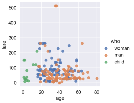
We can see that the plot needs a title and better labels for the x and y-axes. In addition, the two people with the most expensive fares survived, so we can annotate them on our plot.
sns.lmplot(x='age', y='fare', hue='who', data=titanic, fit_reg=False)

plt.title('Fare Paid vs. Age of Passenger, Colored by Passenger Type')
plt.xlabel('Age of Passenger')
plt.ylabel('Fare in USD')

plt.annotate('Both survived', xy=(35, 500), xytext=(35, 420),
             arrowprops=dict(facecolor='black', shrink=0.05));
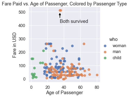
In practice, we use seaborn to quickly explore the data and then turn to matplotlib for fine-tuning once we decide on the plots to use in our reports or presentation.

